MENU

Outfit Inspiration Guide for Families

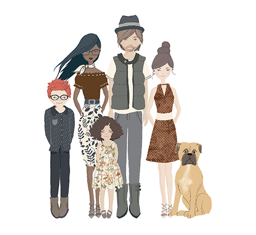
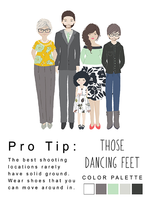
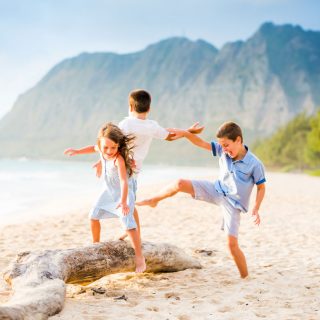
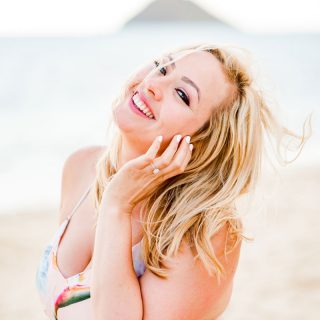
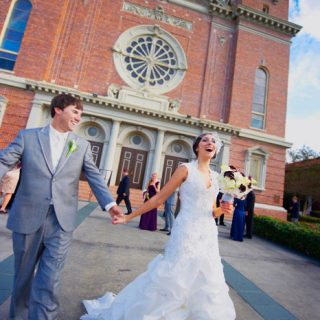
Deciding what to wear in portraits can be a daunting task, and I completely understand!

I’ve included my favorite tips to help you navigate your way and take the guess work out of what to wear. We will work together so that when the day of our session is here, you will be confident and prepared.

If you only remember one thing from this guide, it’s this:

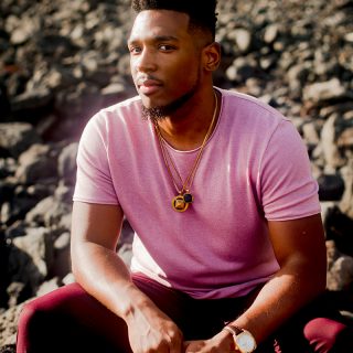
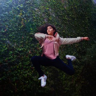
Make sure you wear something that you FEEL AMAZING in!

If you are comfortable and feel confident in what you are wearing, it will shine through!

1. START WITH THE END IN MIND

The first thing to consider when choosing a color scheme is where you plan to hang your portraits if you plan to print your portraits. If your walls are neutral, you may choose your outfits as a way to add pop of color to your room.

2. LOCATION IN MIND

Think about the colors and textures of your session location. If your session is in the forest, forget greens. And if your session is at a castle, forget tans. You’ll just fade away into the backgrounds.

If you want your family to pop against a forest, think reds and yellows. If you want to pop in the city avoid grays. If you want to look your best at a wildflower field, avoid busy patterns. It’s all about balance.

3. COLOR PALETTE

Next, it’s time to select your color scheme.

Don’t match- coordinate!

One patterned piece in your color scheme is great to be a focal item. Once you have a focal piece selected, pull colors from it for the other outfits. You can see a deeper dive on this topic at the bottom of this page.

4. STYLE

Now that you have your color choices selected, the next step is deciding what style of clothing you plan to wear. In general, men look best in well-fits dress pants or dark color jeans and closed toe shoes. For a dressier look, pair with a button down and a sports coat. Or you could add a sweater or henly shirt for a casual feel while still looking polished.

For women, a dress, a skirt and top or tailored jeans all photograph well. High heels help elongate the legs but ae not the most comfortable when walking from location to location. You may want to bring flats to walk in so that your feet stay comfortable.

It is best to avoid clothing with large graphics or logos, tiny stripes, or neon colors as those don’t tend to photograph well.

5. PUTTING IT ALL TOGETHER

It is helpful to think about how these colors will be distributed. For example, if your colors are navy, rust, and tan, it is best to make sure there is a variety in how these colors are used across the top and bottom portions of the outfits.

6. THE DETAILS

Next, it’s time to accessorize. Accessories such as necklaces, earrings, headbands, belts, scarves, and hats will help ties each individual’s look together into a cohesive group.

Take a careful look at detail such as fingernails, sock choices or bangs that might need a quick trim. And don’t forget to floss.

7. THE FINAL TOUCHES

You’ve got the color palette, the outfits, accessories. You’ve thought about the location. You’ve tried on your outfits. You are almost ready.

Consider having your hair and makeup done professionally. This can alleviate stress and put the expert final touches on your looks. Even if your goal isn’t high end glamour, hair and makeup artists can help you help your best selves shine through. Lay everything out 1 or 2 days before your session, and feel free to keep me in the loop about your outfit decisions. Send me photos if you need feedback. I am here to help you.

Don’t forget to iron out those wrinkles! If you have an outfit that wrinkles easily, consider changing into the outfit at the location.

8. PLEASE BE ON TIME

Your session is carefully scheduled to take advantage of the perfect light at your location. I’ve also built time into the beginning of our session so that we can chat and just visit a moment.

The magic that brings everything together is not just your outfits and makeup or my camera and lens. There is a human connection. There needs to be trust and understanding. We need a moment. I will take about 15-20 minutes to guide you through some posing tips and techniques, and then we will begin our session. And because we have all shown up prepared, our session will be fun and stress free.

Together, we will have a fantastic session that tells your family’s story.

Color Theory and Undertones

A Guide to What Colors to Wear and Why

1. How do you know if a color is warm or cool?

Try to imagine that warm colors would be warm to the touch like the colors of a flame, and that cools would be cool to the touch like the water in a sparkling pool.

Warm colors have a yellow tint, and cool colors have a blue tint.

2. What is your skin tone?

Your surface skin tone or complexion is the color you see when you look in the mirror. In general, your skin tone will be fair, light, or dark. When choosing the most flattering colors to wear we need look at the undertone of your skin rather than the surface color.

3. What is your skin’s undertone?

Undertone refers to the underlying color of your skin tone. It can sit anywhere on the spectrum of warm (yellow) through neutral (red) to cool (blue).

There is no undertone that is better or worse, of course, there is a huge range of colors that will suit everyone.


I think the jewelry test is the easiest way to find out where your skin falls on this scale. Under natural light (soft window light, not under a light bulb), compare how a piece of gold and silver jewelry looks against your wrist.

If gold looks best, then you have a warm undertone. If silver looks best, then you have a cool undertone. If both look fabulous, then you have a neutral undertone.


4. What colors are most flattering for you?

Warm Undertone

Your best colors will also be warm, think earth tone, taupe, off white, oranges, warm red, as well as golden tones like brass and amber. You can still wear colors that feel a little cooler, just avoid icier shades of those colors. When it comes to greens and blues, go for a deep emerald and turquoise tones and avoid icier shades of those colors.

Cooler Undertone

You will look fantastic in bright but cool colors, think jewel tones, royal blue, candy pink, lilac, sea shades, pastel greys, and crisp whites. If you want to go dark, try a dark navy rather than black. Try to avoid oranges and yellow which will clash with your undertone.

Neutral Undertone

You will look great in a wide variety of colors, but be careful with bright colors like cherry red and hot pink which could wash you out. Pastels will really suit you as well as greys and off whites.

COLORFUL INSPIRATION

"We live in a rainbow of chaos." - Paul Cezanne

The following palettes are divided into 4 categories: warms, cools, neutrals, and pastels.

I hope that they will inspire you as you put your outfits together. You got this!

WARMS

COOLS

NEUTRALS

PASTELS

CLOSE